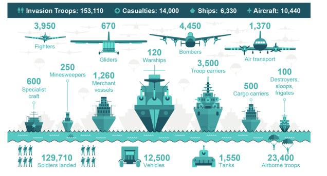
June 6, 1944… D-Day. How big was the invasion? This graphic, courtesy of the BBC, shows the sheer magnitude of the allied forces that stormed the beaches of Normandy that day.
Normally, in presentations and graphic design, less is more. I prefer one statistic on a slide or one story. This is a rare example, however, of a slide where more is better.
An impressive slide that serves its purpose.
